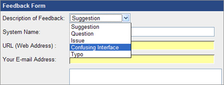
Payment gateways have the most confusing web interfaces. There’s no consistency among systems, and most of them look like they were designed by an 8 year old.
As I was configuring viaKLIX for a customer, I stumbled across this great feedback form. They actually have an option for “confusing interface.” How appropriate.

This is a classic case of a company seeing a problem and applying a band-aid to the problem, and never fixing the root problem. In this case, a confusing interface.
Seth Godin, a marketing wizard who has written many books I admire, says this about band-aid marketing: Every quarter, your company ships new products or services. And every quarter, someone says, “under the circumstances,” or “given the deadline” or “with the team we had available”… it’s the best we could do. I say ship nothing.
Good advice.